|
|
Post by Little Comet on Aug 28, 2013 15:26:10 GMT -5
Heheh. That's alright...
Notice that the fairyland background has changed...
That was actually an accident... Not one of my best moments. I actually like it better now. Heh...
|
|
|
|
Post by pinkycrystal on Aug 28, 2013 22:44:52 GMT -5
I agree. The text is so much better to read and the colours don't clash anymore.
|
|
|
|
Post by Evelyn on Aug 29, 2013 12:55:49 GMT -5
Ad I like some of your newer backgrounds, so much easier to read the text now.
|
|
|
|
Post by Little Comet on Aug 29, 2013 14:29:58 GMT -5
Ah! Good! I feel so proud of myself... Haha  |
|
|
|
Post by pinkycrystal on Aug 29, 2013 15:11:16 GMT -5
I really like your new 'Simple' background.
|
|
|
|
Post by Evelyn on Aug 29, 2013 19:29:49 GMT -5
The 'Autumn' one's not bad either.
|
|
|
|
Post by Misha on Aug 30, 2013 7:04:56 GMT -5
Yeah the backgrounds are great LC. I'm using the Autumn one currently but it's good to know that if I ever get bored all of the different backgrounds will look ok
|
|
|
|
Post by Evelyn on Aug 30, 2013 14:13:35 GMT -5
Well, I found some seamless backgrounds that can be tiled, I'll post them here, I may have to double post, sorry... 'Flower Power' - could look good with a tan or beige outline and shading, plus plain black text. 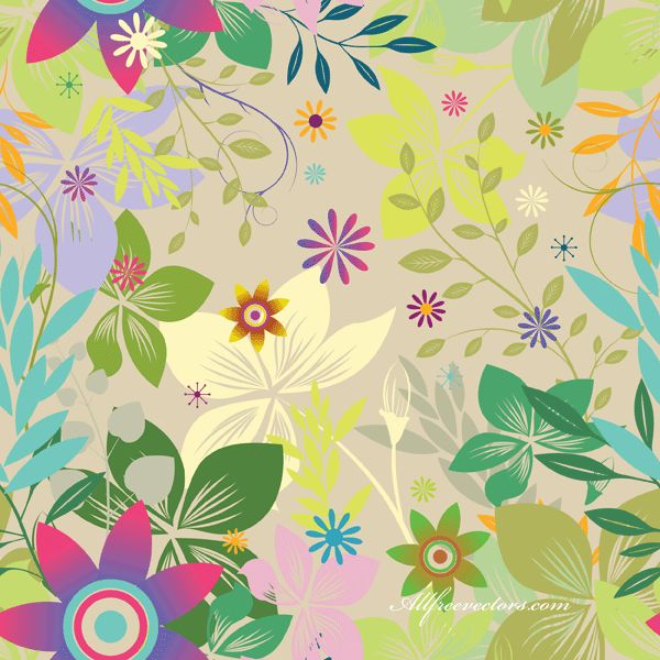 'Bubbles of Silver' - Grey outline, plain white 'shading' and black text 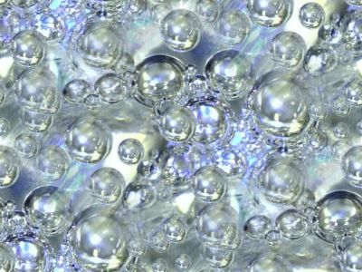 'Cave of Crystal' - Maybe a navy blue outline and everything else really normal 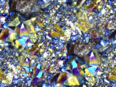 'Crystals of Blue' - Gold outline (or darkish yellow) with a slightly yellow (very pale!) background shading and black text 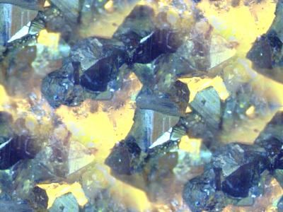 |
|
|
|
Post by Evelyn on Aug 30, 2013 14:25:38 GMT -5
Remember these all have to be tiled, that will work best. Simple Paisley - slightly olive tinted shading, dark olive outlines with dark brown text. 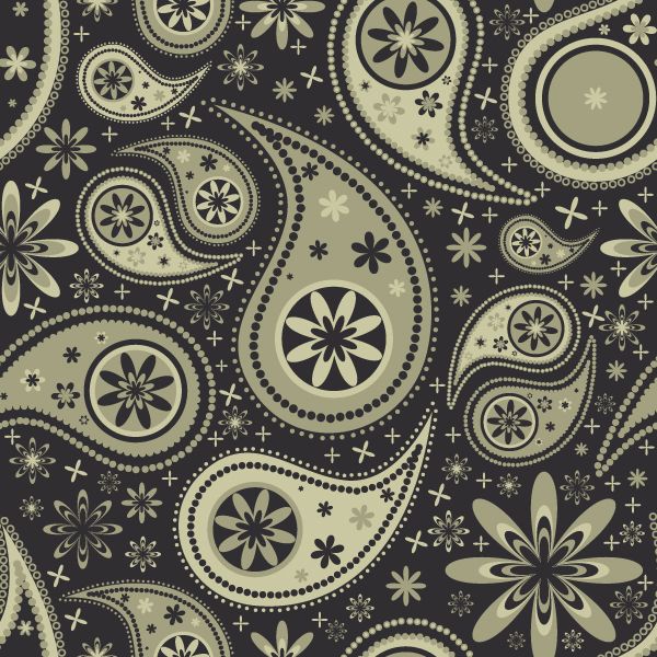 River of Red - goes with a dark crimson or burgundy and then black text on white background.  Into the Vortex - Black/indigo outlines with inverted shading, one block dark purple, next white, with white text on one block and black on the lighter block.  Fiery Delights - Orange outlines, white backgrounds, black text.  Nature's Beauty - A dark brown outline, slightly green-tinted shading and black text. 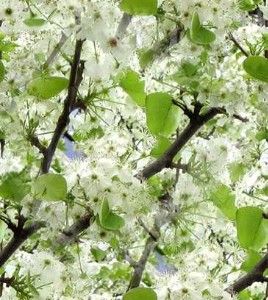 EDIT: whoops, totally put those in the wrong thread... |
|
|
|
Post by Misha on Aug 30, 2013 15:16:28 GMT -5
I really like the Simple Paisley one.
|
|
|
|
Post by Evelyn on Aug 30, 2013 15:28:17 GMT -5
Same here. I reckon that some of these are too...sparkly...but they were the best I could find that weren't just stripes. And I've got a few more, just waiting for them to upload now
|
|
|
|
Post by Little Comet on Aug 30, 2013 17:05:04 GMT -5
I like them. A LOT. Like seriously I'm going to make every single one of them. Right after the admin board starts working again. Every time I try to make a new theme it gives me an error message, saying that the Proboards team is "working on it". ARGH!!! Hence the "Butterfly Garden" It got me THAT far and then crashed.  |
|
|
|
Post by Evelyn on Aug 30, 2013 20:21:06 GMT -5
I see...there are more in the 'Skins' in case you didn't already notice...you can make up your own names for them, I don't particularly care what they're called.
|
|